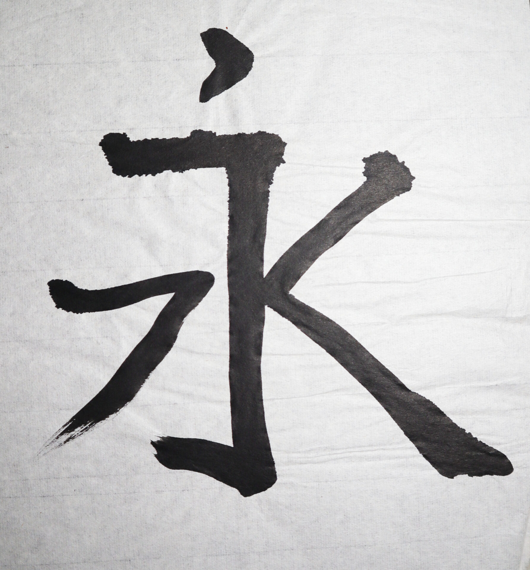
These two shodō (Japanese calligraphy) works were created while I was living in Japan, where my husband was stationed at Yokota Air Force Base. During that time, I had the opportunity to study shodō under a local instructor, learning traditional brush techniques and the cultural significance behind each stroke and character. The first piece represents […]
This printmaking project was created in my Intro to Printmaking course and showcases the full process from concept to final print. I began with a detailed sketch, then transferred the design onto an acrylic plate by scratching into the surface using an intaglio technique. The etched lines held the ink, allowing for intricate detail and […]
This artwork was created for my college Drawing II course and explores the use of temperature in color to convey light and shadow. The piece uses warm hues—such as reds, oranges, and yellows—to represent areas of light, while cool tones like blues and purples define the shadows. This contrast enhances the sense of depth and […]
This piece was created for my college Color & Design course as part of an assignment exploring tetradic color schemes through collage. The project focused on combining vibrant, contrasting hues in a balanced way while experimenting with line as a primary design element. I used a mix of oil pastels, ink, and colored pencils to […]
This print of a dog was created in my high school art class using the linocut technique and features my family pet, a Schipperke named Skippy. I began by sketching his image onto a linoleum block, then carefully carved away the areas I wanted to remain white. After rolling black ink over the raised surface, […]